Can your design be produced? – Packaging Production
Consumer Packaging – making something physical rather than
something digital.
Digital to Manufacturing – Technology has evolved in such a
way where, in what used to be a traditional way of designing, is now very much
digital all the way up to the production stage. So, it’s critical that, as
designers, we understand how to translate from our digital designs to the 3D
world.
Our designs need to be able to translate from digital to physical
in the way in which we envision it. Or we will create an unprintable design.
Its important to have the knowledge on packaging production
as a designer, as not only will your designs will work, but you can communicate
any issues or solutions to the production team.
Some elements which can be used in packaging production are:
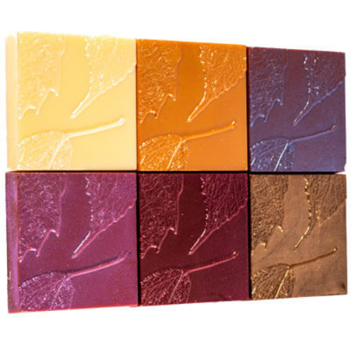
Flocking – applying small fibre particles onto a
surface, this will achieve a fuzzy suede texture
Embossing – creating raised or recessed designs into
the packaging
Silk screen – a mesh sheet is used to transfer
ink onto the packaging
The packaging can be a collectable item, it doesn’t have to
be something which we throw away. Especially if it’s done successfully and has
a reusable purpose.
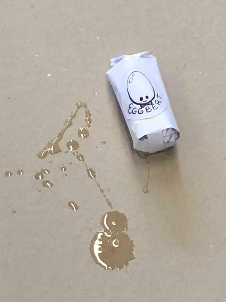
Egg drop challenge
The egg drop challenge involved
creating protective packaging for a raw egg, in which it could be dropped from
several different heights without breaking.
Our group first looked into if using a square packaging or cylindrical packaging would work best, deciding that cylindrical packaging would assure that if it rolled onto its side from the fall it would lessen the impact by rolling.
I knew that sitting the egg up works best, as the two points on the bottom and top are its strongest (I have three chickens). So we worked on adding structural integrity with crumpled paper and straws.
Unfortunately, as the photo and video shows, our packaging didn’t last. The main issue was that the bottom, which hit the ground, was too harsh.
Mad Passion redesign – Assignment 1
Working on the next assignment, I wanted to find out more about the logo and what it meant to Tresna, the owner. She explained that it was painted by her son, and for her it symbolises:
The love of family
The calmness of nature
The natural ingredients in the products
These points help solidify the direction I would like to work on with the re-design. Putting a spotlight on the values of the brand.
It doesn’t leave an ecological footprint or
leaves a small ecological footprint (An ecological footprint is the impact
humankind leave’s on the earth, in term to the use of resources and the way we
dispose of the end product).
Packaging which is, in some way, recyclable
and/or reusable.
Using a minimalistic design, which optimizes the
smallest amount of packaging.
Thinking outside the box: unwrapping a massive packaging
problem – Reflection
This Guardian article discusses the issues with online shopping in terms of mail packaging and sustainability. As it may be travelling interstate or globally, the packaging needs to protect the product inside, but this can increase the percentage of non-recyclable waste produced. An example of this is the use of single use coffee filters, which often are not recycled appropriately as the common consumer doesn’t know how or doesn’t bother to.
This shows that as designers, we need to be aware of these issues. If the packaging needs extra care when being recycled, we can incorporate instructions into the design or find other solutions. Like double use objects or collectables, to encourage consumers to keep their packaging.
The article brought up the important point, that although, in the end, it is up to the consumer with how they dispose or recycle their packaging. It is the responsibility of the brand to give them the opportunity to do so.
Materials and Manufacturing for Global Markets –
Reflection
The CNBC video discusses the eCommerce market, and the use of corrugated cardboard boxes in transporting packages. Particularly with Amazon, as they are the largest market for cardboard shipping boxes. There has been a substantial growth within companies for cardboard packaging in the shipping box market. This has brought up the issue with the companies carbon footprint, if the cardboard box needs to evolve or go.
Amazon has started using less boxes and different types of packaging. Such as the frustration free packaging – which is packaging used from recycled packaging. Which is now reducing packaging materials, so eCommerce can be the most sustainable course for packaging. They are also using flexible plastic packaging for smaller products.
In relation to my next assignment, I research ‘zero
waste’ skincare brands. To use as inspiration for my own skin care redesign.
Flora and Fauna
Flora and Fauna markets itself as an ‘all-natural, vegan and organic’ skincare distributor. They sell an extensive range of skincare products, such as moisturiser, facemasks, toner, cleansers and skincare applicators. They have partnered with Terra-cycle, so customers can return their empty packaging to Flora and Fauna and they will reuse non-recyclable packaging (such as melting down the plastic and using it for other objects). Some brands that they sell are; Acure, Dirty Hippy Cosmetics and Sukin.
Biome
Biome sells such skincare brands as; The Physic Garden and Noosa Basics, but also sells their own brand of skincare. Their brand identity is ‘100% plant, ocean and earth’. Their toner’s in particular are marketed as 100% one ‘naked’ ingredient such as witchhazel or rosewater. The toner packaging is glass bottles, and they promote their naked beauty store which you can re-use the packaging.
Lush
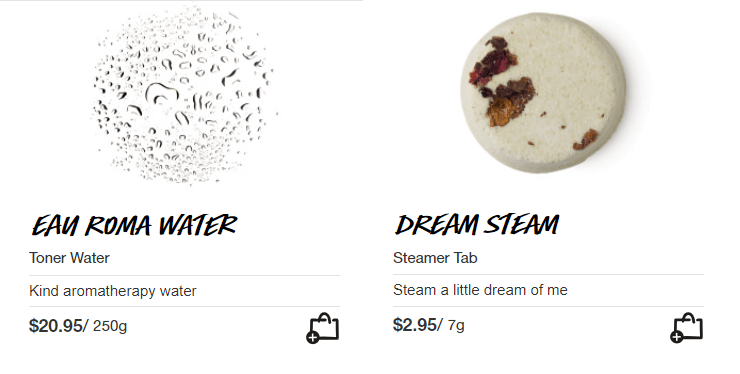
Lush markets itself as fresh, handmade cosmetics. It is the most well-known of the three skincare brands. Lush have opened store fronts called ‘naked stores’ around the world, promoting the use of zero waste products. Their toners are marketed without packaging, to use their ‘toner tabs’ you drop them into a bowl of hot water. They also list all their ingredients in an easy to read format and identify which are natural and which are ‘safe synthetics’.
BMW Car Wrap Presentation
The BMW car wrap presentation was on Friday the 6th of September, it discussed exactly what was needed for the competition and explained BMW’s brand identity. They discussed the importance of ‘Premium mobility solutions’. Some elements were:
Athletic elegance
We design more than cars, we awaken passion
We inspire people on the move
The theme for this years BMW car wrap competition is the Bauhaus Movement. The 20th century movement covered a range of creative mediums; from visual art to furniture design and architecture. It originated from 1919 Germany by Walter Gropius.
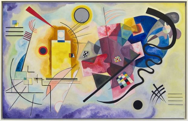
An artist I’m particularly inspired by is Wassily Kandinsky. A Russian painter and one of the pioneers of abstract art. Two of his painters are seen to the left. His artwork interested me as I find his use of colour and flowing shapes not only aesthetic, but also a technique which could translate well to the curves of a BMW car.
Remove the emotional side when presenting work,
accept criticism (not personally) as it will help you in the end.
Prep –
A summery of key points (structure to the
presentation).
Practise and practise – it’s a confidence
booster when you know your presentation in and out.
Make props – do mock-ups and large sketches.
A pitch in the real world: Research who is in
the room (who are they, why are they there, what do they bring, what do they
want to hear from you?).
Accepting and giving critique –
Assess flaws in the design.
Identify the good and the bad (a feedback
sandwich: positive, negative, positive.)
Analyse brief and how it came cross.
It’s a new perspective on the work.
Is the print production technique successful in appealing to the target market, and why/why not?
Looking at three packages with different techniques; e.g. embossing, foil stamping and die-cutting. I will analyse the products in terms of the target market. I focused on cosmetic and hygiene packaging, as the market is overflowing with competing brands. So the individual product must stand out and have great shelf presence.
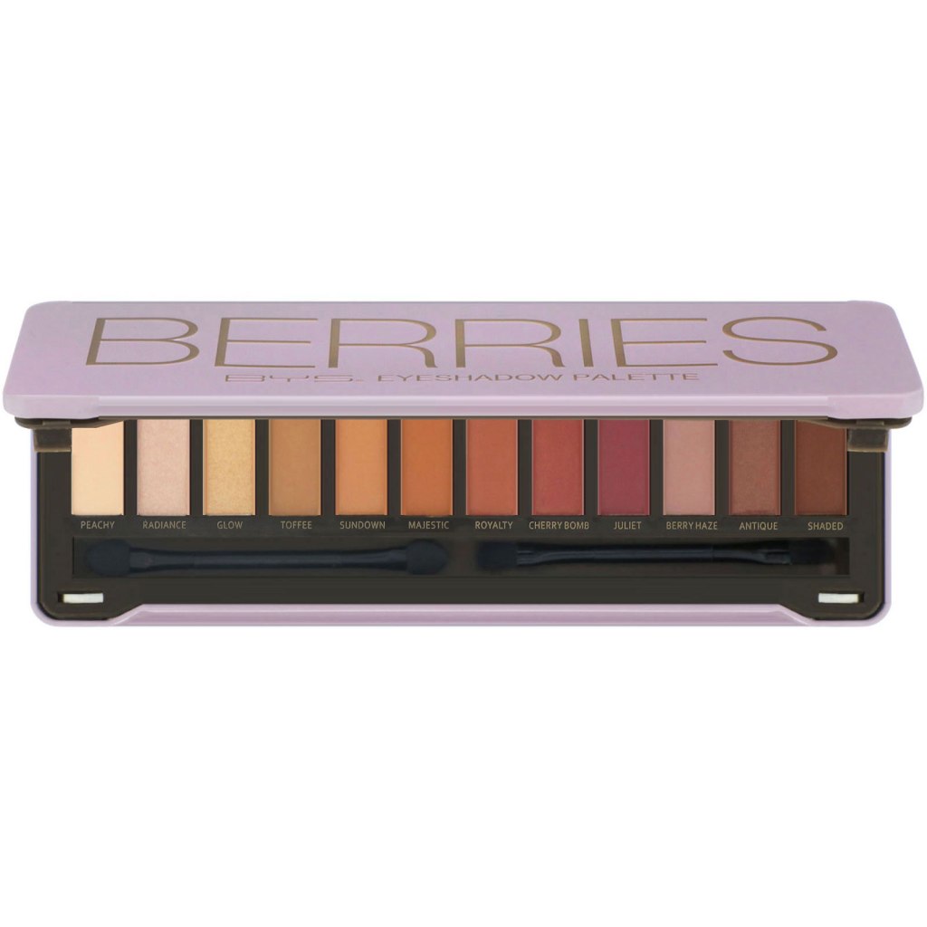
BYSCosmetics – Embossing
BYS Cosmetics is a makeup brand commonly found in Kmart and Target, its a inexpensive brand targeted towards young women and teenagers. With eye shadow pallets called ‘Berries’ and ‘Fierce’.
The packaging incorporates metal embossing on the lid, extruding the wording to give a 3D effect. This gives the packaging a unique and eye catching effect. It also makes it look more expensive, which attracts consumers.
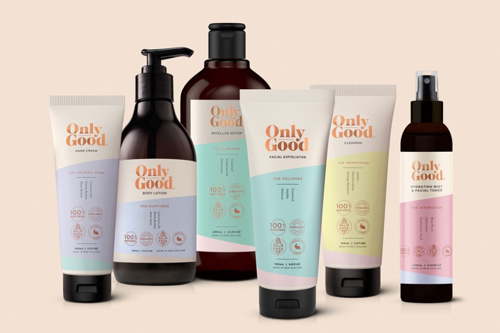
Only Good – Foil Stamping
Only Good is a New Zealand all natural skin care brand. They have skin care, baby care and hair care ranges, all vegan and cruelty free. Their target market are those who are interested in cruelty free, sustainable products, their pastel colour scheme could be marketed towards young people.
The packaging incorporates a gold foil stamping effect on the logo, on both the plastic and cardboard packaging. This gives the packaging an edge, as it stands out on the shelf and in photos.
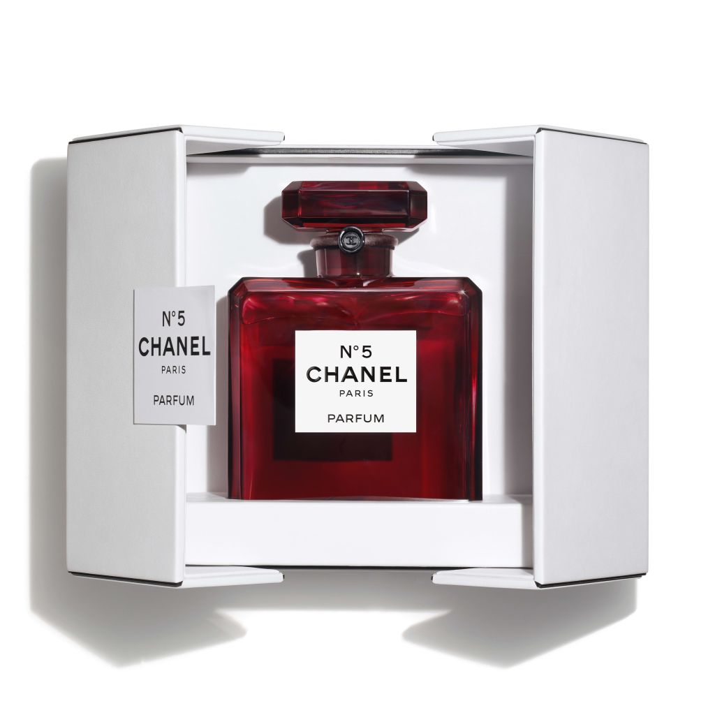
Chanel perfume – Diecutting
Chanel is a prestigious and expensive perfume brand. Their target market are women who are looking for a high end elegant perfume, although Chanel cosmetics are marketing towards young women.
Their complex diecut boxes give the user a experience, which is what they expect for such a high end product.
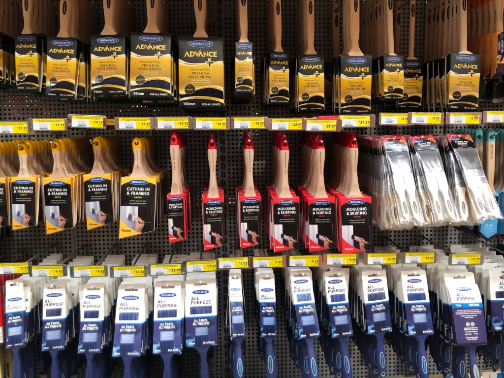
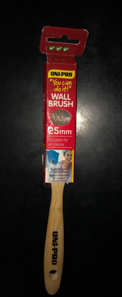
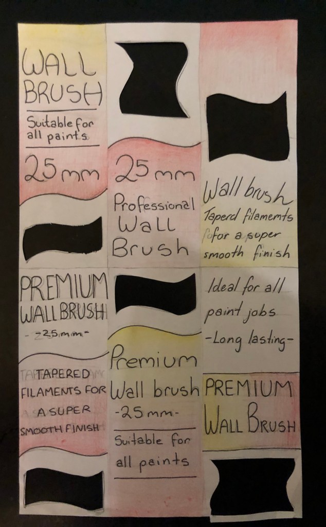
Paint brush Redesign
The challenge was to find a paint brush from Bunnings, $5 or under, and redesign the packaging for it to increase the value of the product. My goal was to redesign it in such a way that you could potentially double the price without the re-branding process costing the company substantially.
My process went as follows:
I bought a $3.90 ‘wall brush’ by Uni-Pro. I then
examined the other paintbrushes on the shelf around it. Focusing on the
expensive brushes, to figure out what the competition is and how I can give my
re-design the design face lift.
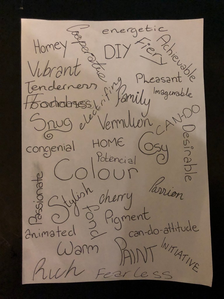
I created a mood board for the ‘brand identity’,
focusing on buzz words such as; Red, vibrant, family and home.
I brainstormed a list of words and typography; using
the same buzz words for the mood board and expanding them. Working on the pretence
that the target market are average families and adults working on home projects
and painting houses, rather than the professional.
I then worked on prototyping, working with the
key points I wanted to fix, from the initial analysing of the brush. These
were; adding an open window so the customer can touch the bristles, simplifying
the design – hence making it sleeker and more modern, using the buzz words on
the back of the brush (such as ‘Tapered filaments for a super smooth finish’ which
makes it sound more prestigious and professional). I also decided to keep the
red and yellow colour scheme, as it is eyepopping and bold, hence giving the
small product solid shelf presence.
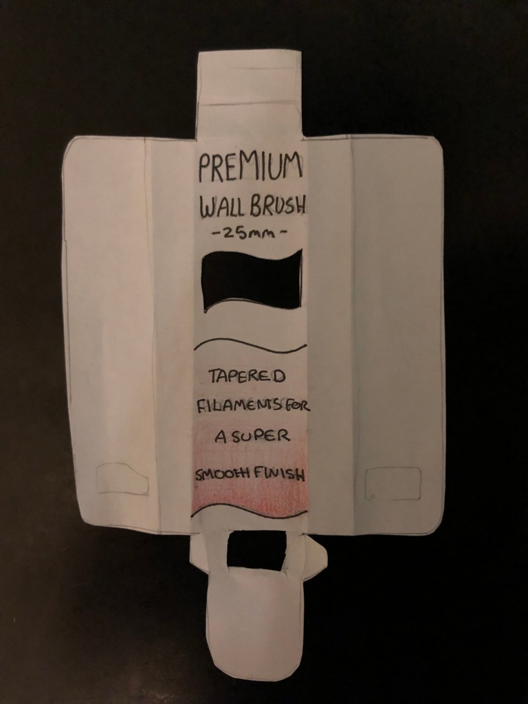
From the last stage, I melded my favourite
designs into one mock-up. I took away the UNI-PRO logo from the packaging, as
it is on the brush itself. Instead translating it into the cut-out window. I
also followed the flow of the lines into the packaging’s visual design.
All of this was done traditionally, as I found it helpful to work with a pen and pencil format for this week-long project. The next stage would be translating the design digitally, which would open up new problems and solutions, and working on the back and sides of the packaging. I also planned, in my final design, to flip the brush itself and take away the tab, instead hanging the brush from its handle.
Mad Passion Redesign
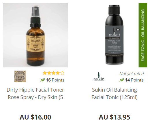
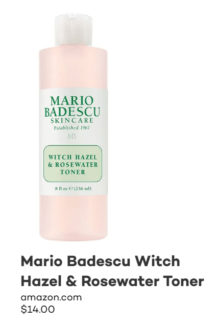
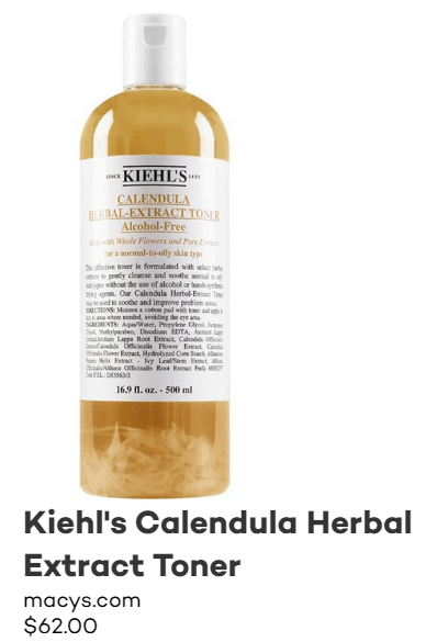
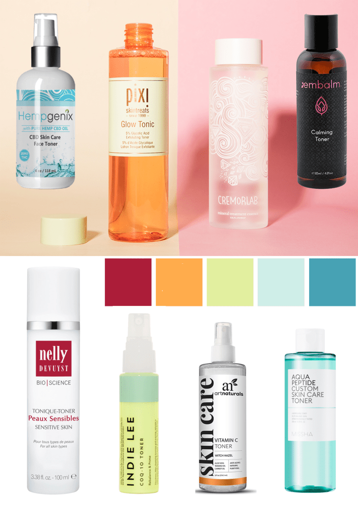
Looking at other skin care brands, I found three popular face toners. All from well known brands, but all at different price points. This will give me a good base to work from when redesigning my next assignment, which is the ‘Mad Passion’ Witch hazel and Lime Toner.
Some common factors in all these toner packaging designs are:
All have a basic colour scheme – of one or two colours (including the colour of the bottle.
They all have a flip top instead of a spray – some people prefer spray as its easier to use (you can just spray directly onto your face instead of dripping the toner onto a cotton pad and wiping). But with the flip top you are saving more product.
Commonly they have a simple and clear design on the front label.
Key Points for my redesign:
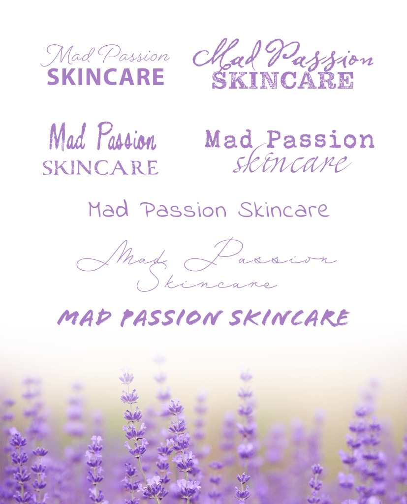
Digitalise and modernise the logo – it’s such a nice logo but at the moment it’s getting lost due to lack of structure to the label and poor printing.
Use recycled glass bottle – less of an important point, but I would like to find some companies which supply bulk recycled glass for low cost as a reference point.
Clear labels VS stickers – can I find a sustainable clear label?
Label for the front and back – put product information on the back.
They put it in a separate bag – add another outer packaging for the product, to protect the glass. Which will make it look more expensive and prestigious than changing the bottle to plastic.
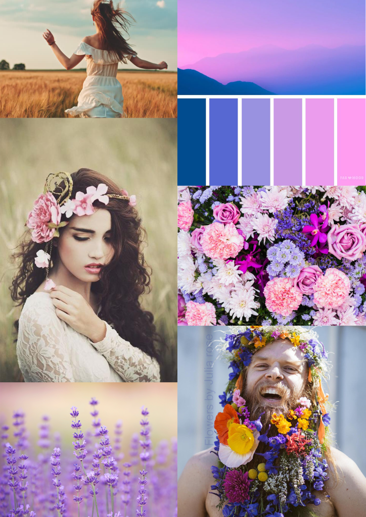
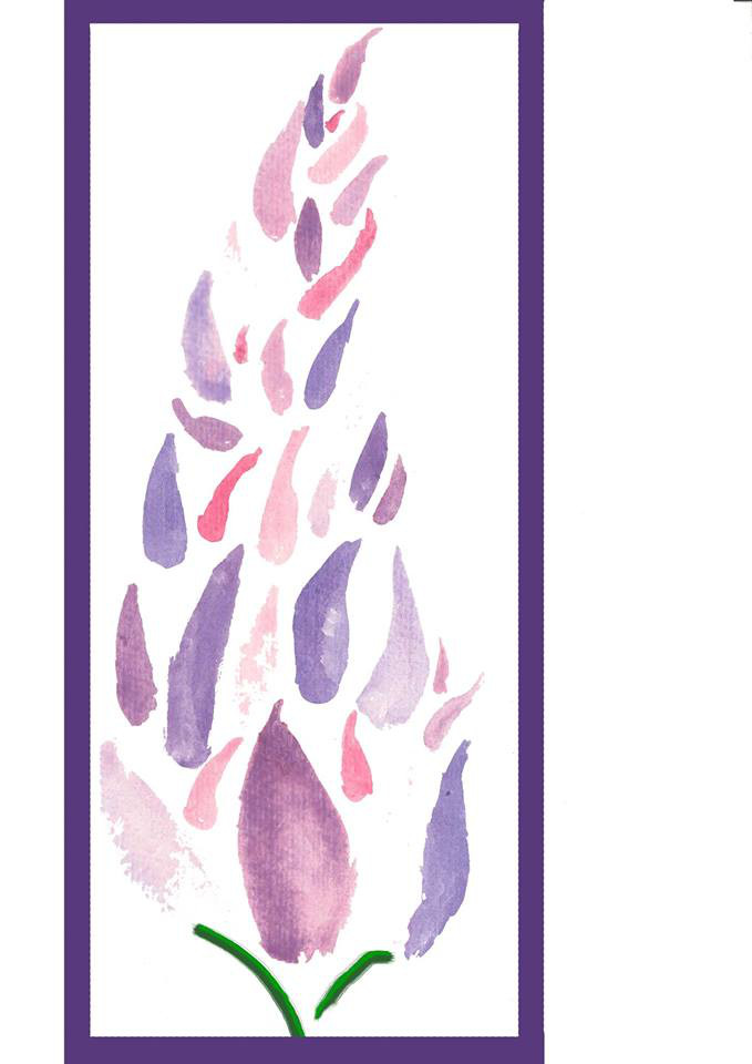
Below to the left is the mood board for the brand identity, which I am exploring. I want to focus on a feminine/androgynous feel, as there are the floral symbol and the warm pastels.
Below to the right is the mood board for other toner brands. So I have a sense of the market and the competition. I will continue to reference it as I progress with the design process.
To have a brand ‘revamp’ – to make the product
more interesting.
To make the packaging more sustainable or
recyclable.
To maintain a position on the shelf and in
marketing– if the product has gone stagnant.
What a brand wants a ‘refresh’ for their product – what
does this mean?
To have a change, to gainer more interest from
potential customers.
To make the packaging more modern – to make the
product look new.
Just to make tweaks, to change the ‘feel’ of the
product.
How and why do designs go out of style?
Trends change.
Technology and cosmetics progress and evolve.
Design and typography go out of style.
Isn’t it our job as designers to design things to be
timeless?
We can only give an independent point of view,
what the mass market wants at the time.
Elements which we identify as ‘timeless’ can
evolve into cheesy or bad.
Can a good design still need an update – or is that a
sign of a bad design?
Different industries have different needs; such
as the food or technology industry is always changing, but the fashion industry
is built on a heritage.
You need to do the research in what the customer
wants, you can’t just change an established product without thought.
Packaging Redesign Reflection– Lynda
Diet Coke Redesign – Coca cola wanted to capture
brand loyalty for a younger generation, while keeping its older market in mind.
They wanted the brand to be more relatable, using a sleek design with new
flavours. Using a highline to represent motion, a strip of colour and a taller
and skinner can – Coca cola could gain interest from a range of consumers.
Logo’s are the foundation for the brand identity
– it helps the consumer relate the product to the company and the brand. But design
elements can also help strengthen the connection E.g. Apple’s packaging design
can be connected to apple without the logo (simple colour apllet, sleek and
modern design).
Audience recognition is an important element to
keep in mind when doing a redesign – what is the brand identity and how does
the packaging need to convey that?
Young guns season 2 – Packaging redesign
Young guns season 2 critiqued young designers from all over
the world. Some points which I took from the videos were;
When working on food packaging, some important
elements to incorporate into your design process are; does it have appetite
appeal, does it have shelf presence, does it highlight the products features
and is it appropriate for the brand/product.
Be aware of how the consumers view packaging in
store; what pops out to you, how do you make purchasing decisions based on
value?
Who is the intended user for the product and how
does that correlate with where the packaging sits in store?
People don’t buy what you do, they buy how
you do it.
I have found these design challenges really helpful in
understanding my own design process and what I need to improve on. I find that
I spend too much time on some parts of the process and don’t enough time on
others – I spend too much time in the research time and not enough on the prototyping/brainstorming
stage.
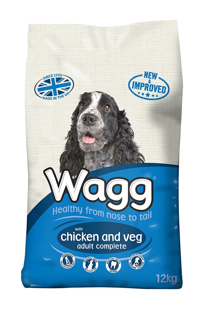
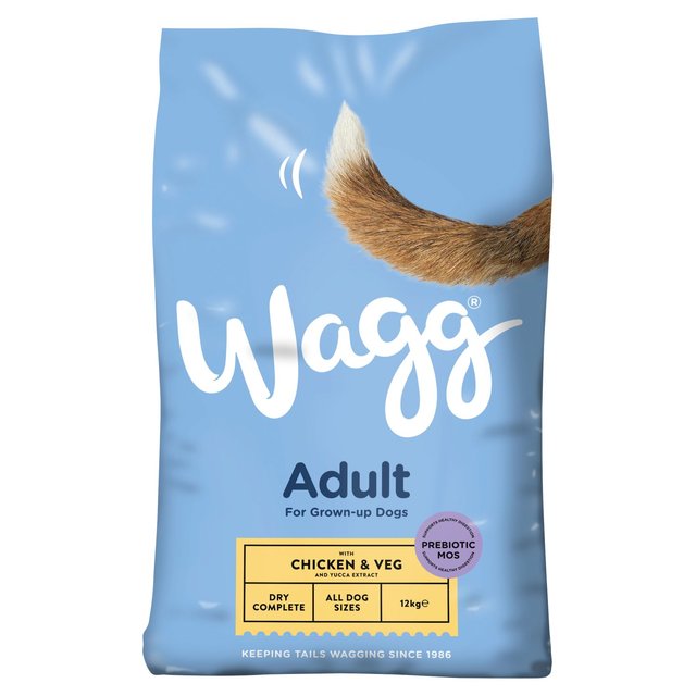
WAGG Dog food redesign:
WAGG, an Australian dog food brand, had a massive redesign
in 2018. As defined by Packaging Europe, this redesign was due to the brand
wanting to strengthen their brand values and displaying a ‘prestigious style’
in a low-cost product for the common consumer. Their old packaging displayed different
species of dog for each flavour, with a bold bubble font.
Some positives with the new packaging was:
A sleeker and more modern look.
The lack of one species of dog makes it seem
more inclusive (for every dog).
A bright bold colour scheme, which gives the
product an eye-popping shelf presence.
Some negatives with the new packaging was:
Besides the dog tail and the connotations to the brand name ‘Waggs’; the product doesn’t come off as a dog food brand as well as the old design.
The information on the bottom of the packaging is laid out in a way similar to wine or coffee.
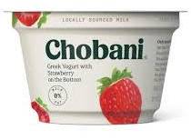
Chobani Greek Yogurt Redesign:
In 2007 Chobani Greek Yogurt was launched; and in preparation for its 10-year anniversary, the brand launched a packaging redesign in 2017. The new packaging was designed to give the brand a traditional look, which in turn would give it heritage and prestige. Out of the three packaging redesigns here, this rebranding is the most successful.
Some positives with the new packaging was:
The layout of elements meant that the first thing
customers spot is the Chobani logo.
The typography change not only gives the design
a more traditional look, but the chunky, smooth serif also helps convey the
richness of the yogurt – rather then the bold and clunky old font.
The water colour strawberries give the packaging
a homier vibe, rather than the cliched photographed strawberry on the old
packaging.
Some negatives with the new packaging was:
Taking away the red band on the top can be a
risk to shelf presence, as the new packaging doesn’t pop out on the shelf as
well.
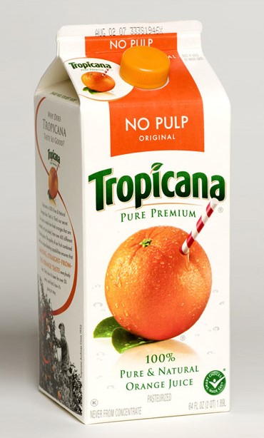
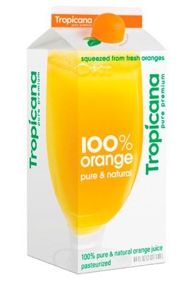
Tropicana redesign:
In 2009 Tropicana redesigned its packaging for a more modern
look, however the rebranding was a huge failure and they reverted back to the
original packaging after many customers rejected the new brand design.
Some positives with the new packaging was:
The orange cap is a creative feature (with not
only the colour but also the texture of an orange replicated), which helps
signify that the packaging is orange juice – however it is not obvious and can
be missed on first inspection.
Some negatives with the new packaging was:
They lost significant money due to their brand redesign,
this was because the new design took away from brand loyalty.
Taking away the orange imagery from the front of
the design meant that Tropicana lose the connotations from that.
Although the new typography is more contemporary,
it loses its brand identity due to design and layout. As, at first glance, the
juice doesn’t convey that it is ‘Tropicana’.
Redesign challenge:
Find a product under $5 from Bunnings – get a paintbrush –
have a look at other more expensive packaging
Start with an image/s – for inspiration Mood
board – three/four images
Come up with words from image – 50 words
Pick a type Face – typography 50 professional
Start sketching – making prototypes – using
boxes and cutting them out and adding things to them. 50
Pick best sketch – best prototype – top 3 of
different sectors (bespoke, commercial, experimental)
Colour choices – colour theory – find all
colours which aren’t right – find specific colours
Start exploring packaging designs – explore what
goes into the package (pricing, place)
This week we focused on starting our redesign assignment, looking
at local designers and distributers in Canberra. I focused on the Wanniassa
Markets, as they are local to my area. Besides exploring and analysing local
artists; I also found that, although the shop front was homey and interesting,
their packaging wasn’t well developed.
The products I bought came in plain paper bags. Depending on
my time frame, within the first assignment I would also like to work on developing
packaging for the Wanniassa markets, in which they can use it for marketing and
promotion purposes (e.g. as simple as a more structural paper bag with their
logo, or as complex as a fabric keepsake).
Local packaging design:
Industrial design – SKEEHAN
Use sample kits to attract new business, with interesting
packaging. For small business, packaging is often overlooked and neglected, due
to costs and time.
For small studios, it’s important to look for cheat sheets,
ways to get products out quicker and save money and time.
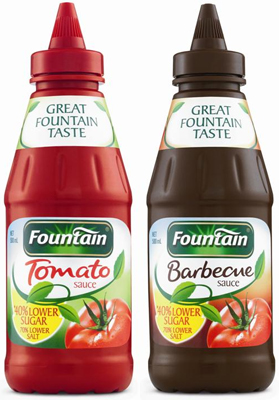
Fountain sauce:
Sauce bottles went from glass to plastic. A new bottle means
a fresh face. But there are a lot of barriers; one which has to do with the
engineering side of production, eg. Blow moulding. Due to no preservatives in
the Fountain sauce recipe, they had to heat up the bottle more which didn’t
work with some common bottle shapes. They also want the plastic bottle to match
how the glass bottle looked, as there is brand identity and history in it.
Packaging techniques:
90% of the time, the box you’re thinking of has
already been designed. Look for shortcuts.
Design isn’t just the most important element –
we also have engineering, machinery, packaging, that all goes into it.
Elements of design can make products looking more
‘prestigious’; such as gold, medals, and using French – what can you do to make
a product look ‘more premium’.
Many kid’s cereals have cartoon characters
looking at the cereal, adult’s cereals have a healthy, conventionally attractive
person looking at us.
Companies pay money to get shelf presence – for
the perfect height, for the brands close to it.
How is the product packaged – how the customer
interacts with the product?
Banana is Pantone buttercup 12-0752 TPX – better
chance of buying the product – the colour that is perceived as fresh. Farmers
manipulate their produce.
By knowing how things are made – this will help
us construct concepts.
Young Guns packaging challenge
The Young Guns redesign challenge focused on 5 young
designers around the world (India, UK, NJ, US and Egypt), who needed to
redesign the packaging for a $10 or under pharmacy product. They could change the
colours, logo and images/graphics. But must keep the typography.
The designers choose items like soap, toothpaste, lotion, lozenges
and antifungal medication. They focused on design elements like; element and typography
hierarchy, key traits, logo re-design and typefaces. The process started with
traditional sketches, which then translated into digital design. Some designers
focused on a functional design, while others worked with a loose design (with
no master grid).
In the critique process, the judging criteria went as
follows:
Brand integrity and product positioning
Shelf presence
Improvement
Clarity and communication
This criterion was really helpful for the next assignments
in this unit, as it helps give a base to work on when designing or redesigning
packaging.
Some critique the judge gave to the young designers, which
is important to keep in mind when designing my own packaging, was;
‘What do we need to communicate?’ Figure
out what elements are important (for not only the design, but also the
information about the product for the consumer) and how you are going to display
them. As well as the relationship between the elements.
Bold colours on the packaging give better shelf
presence. (‘customers look for distinguishing marks on packages’).
A simple, clean layout can read really well.
‘Feature the unique parts of the product’ When
changing logos, be careful if you are taking away or translating information,
this taking away brand equity.
‘Highlight the unique features of the product’
Is there unique elements which need to be highlighted or solidified.
When designing a packaging don’t just think of
it as a 2D design, but as a 3D object. How can you elevate the design in a 3D form?
Push the boundaries of design
Use gridlines to help you design!
Rules (lines) can help group pieces of
information together.
If the product is beautiful – don’t hide it with
packaging. With Premium products – less can be more.
Look at other products which relate to your redesign
– especially those which are more premium as that will help how you can elevate
your design.
‘Tie designs together’ choose an aesthetic
and extend it through the design, which will tie the elements together.
Visit to retailers of local designer goods: The Markets
Wanniassa
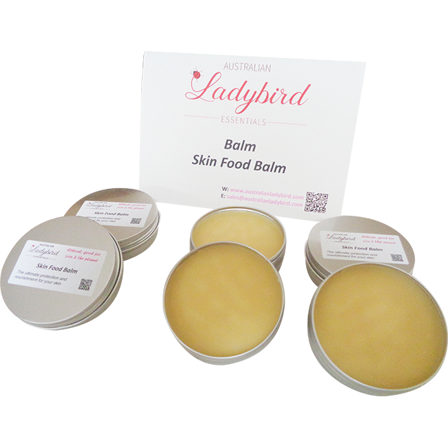
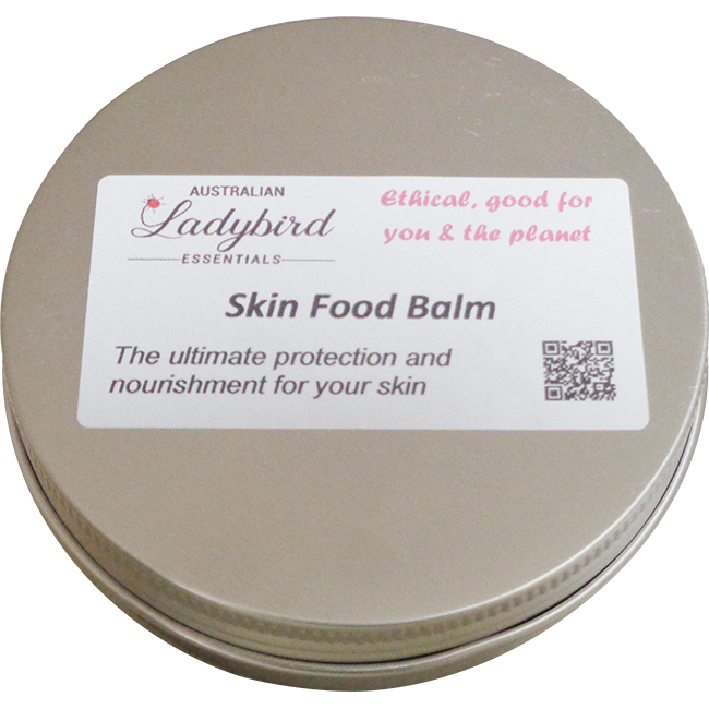
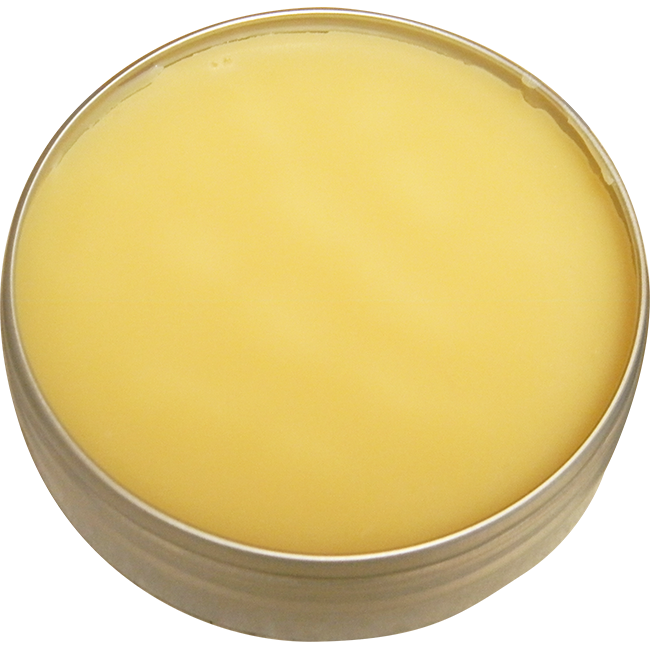
Lady Bird Essentials
make a range of natural skin care, including scrubs, balms, and moisturisers.
They’re packaging is simple, different sizes of metal tins with a rectangle
sticker on top. Their logo is their brand title in cursive typography, with a small
lady bird attached to the ‘L’. The identity of ‘skin care’ isn’t articulated
well in the packaging; even the title ‘Skin Food Balm’ on the tin leaves some room
to wonder what the product is used for exactly. There is a QR code provided.
The target market are women interested in natural skin care. Their stickers
could be redefined to be circles to fit the tins, which would not only give
them more room and clarity with their design, but also offer space to specify
each product. They could also branch out into glass packaging, which is popular
with other high end skin care brands such as La Prairie and Herbivore skin
care.
Item 2: Enigma Fine Chocolate – Madagasca Dark Flower
The Enigma Fine Chocolate was perceived to be the most problematic
when it came to packaging. Despite offering a range of beautiful, fine, chocolates;
the packaging was a plastic satchel. A few of the products on the shelf were
chipped or broken because of this. Even when purchasing one, the store clerk
exclaimed that they were very nice as someone dropped one and broke it, so he gave
them another one and he got to consume that one.
The product itself has a solid brand presence, the logo and the website are professional and relate back to the idea of ‘handmade artisan chocolates’ which the brand is promoting. I feel like their packaging is the only thing lacking. Their target market are chocolate lovers.
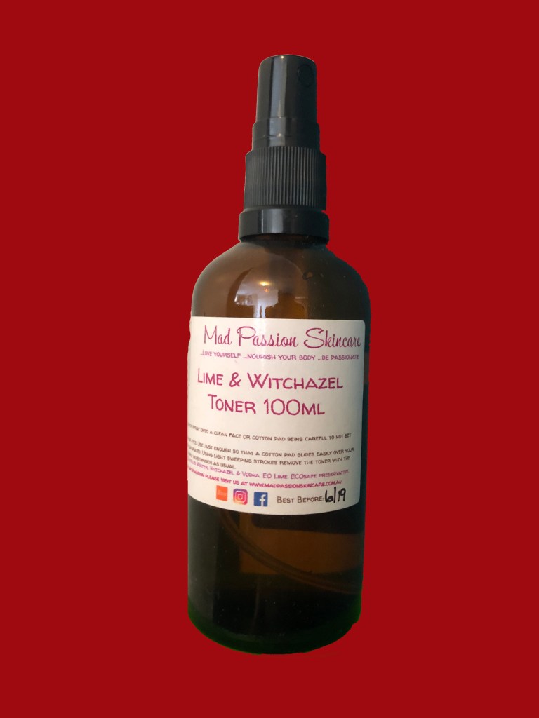
Item 3: Mad Passion Skincare – Lime and Witchazel Toner
Mad Passion Skincare offers a range of skin care products and bath products, including; foams, toner, bath bombs, scrubs and more. The website displays their brand logo well, but the logo gets washed out on the packaging itself. The pink/purple/blue colour scheme appeals to their target market, which are women who are interested in skin care. The glass bottle appeals as it looks more expensive and prestigious than plastic. But it is also more breakable. If I were to take this brand for the re-design assignment, I would want to work on a outer protective packaging as well as the sticker design for the bottles.
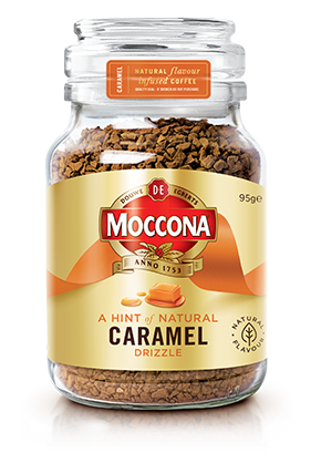
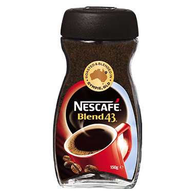
Glass VS plastic in relation to the perception of freshness.
Particularly in regard to the Moccona VS Nescafe brand identity and marketing.
Glass is more expensive than plastic to make; the plastic lids Nescafe use are
also more airtight thus leaving their product ‘fresher’ for longer. But glass has
a perception of prestige and heritage to it, in Moccona’s case. So, although
their packaging is more expensive to make, they gain customers due to their
product looking more exclusive and luxurious.
Brief History of Packaging
Packaging started with food and water, specifically how to transport such goods.
The first packaging was gourds, leaves and logs. Ancient Egyptians invented glass water pots.
Ancient China invented Paper making – which is the first flexible packaging.
Canned food originated from when Napoleon needed preserved food for his soldiers.
The paper bag machine was invented in 1844 by Francis Wolle.
NABISCO used the first folded carton.
The Kellogg brothers popularised cereal in cardboard boxes.
Clarence Birdseye invented frozen food packaging after learning techniques from Inuit and Yupik people.
Tin cans in 1935 needed an opener, hence in 1959 the aluminium can with a pop tab was invented.
In 1946 the first plastic bottle was invented – as it is strong and recyclable.
By 20th Century packaging is an important branding and design element.
In 1860/s brands started using multi-use packaging, e.g. a tobacco tin/picnic basket.
Smith brothers cough drops added branding on their packaging in 1866.
Before the 1890’s, brands had regional presence, but then Uneeda Biscuits promoted their products nationally.
Coca-Cola created their distinct bottle shape so customers could identify them in amongst the copycats.
In 1946, P&G launched the Tide brand with bright colours.
In the 1940s, flexographic printing gave brand designers the means to create bold designs.
Campbell’s soup packaging designs inspired painter Andy Warhol in 1962. Walmart and Costco launched ‘premium’ private brands in the 90s.
In the 1990s, Nutrition Facts appeared on packaging. In 2010 the barcode was influence by the Digimarc Barcode.
Today – packaging is embracing innovation.
Too much packaging is not sustainable, which is why its important to design packaging which is recyclable.
Mislabelled food can harm customers – serialization gives each product a ID code.
New packaging helps brands extend shelf-life.
Pouches are popular modern packaging – as they are lightweight and recyclable.
Retailers expect shelf-ready packaging.
AR (Augmented Reality) can be used as a new tool for engagement. IOT (Internet-of-Things) include smart packaging.
Plant Biomass packaging (e.g. corn) can limit use of plastic for packaging.
Future of packaging includes a mix of math and science – e.g. Signal Rich art
What is packaging?
In its most basic explanation, packaging is a
plastic/tin/paper/cardboard/bioplastic/bamboo covering, originally for food and
water. But it has developed for other products, and now is used for a
significant percentage of products (e.g. technology, cosmetics, accessories,
kitchenware).
Why do we need packaging/ What is the purpose of
packaging design?
We need packaging as consumers; to prolong shelf
life and product longevity, and to protect valuable/breakable products
(especially in a modern age, where products travel globally). We need packaging
as designers/engineers; to use attractive brand design to attract consumers and
to add to the brand identity.
Packaging Design Process for Chocolate Product
When designing chocolate packaging it’s important to keep
some elements in mind, such as; FDA regulations, shelf presence, design attractiveness,
brand identity, and preserving the contents. When working through the design
process you need to; learn everything about the product/consumer base/client brief/packaging
options, and then work all the information into your design ideas.
Packaging Analysis
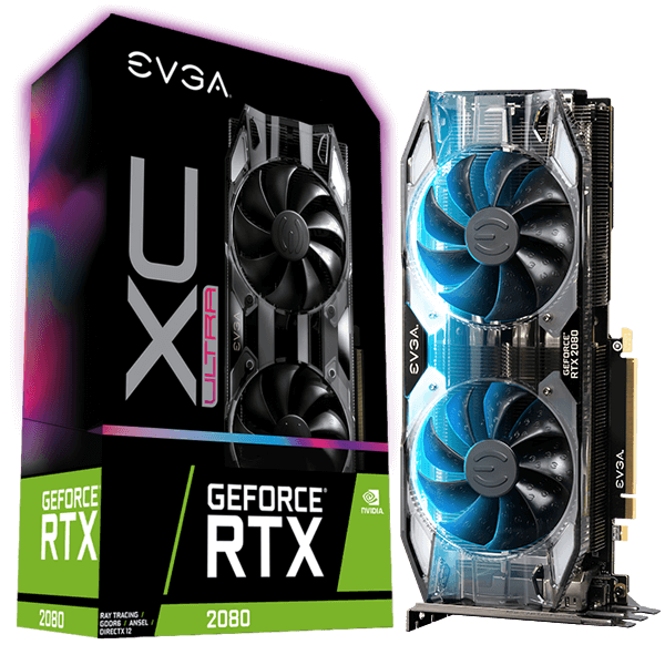
Geforce RTX 2080 by EVGA (Tutorial exercise)
Positives:
Strong brand presence and shelf presence – bold
colour scheme and typography.
Expensive packaging to make – due to the matte
and glossy finish, rounded edges, and cut outs on the top right corner and the middle
opening of the box.
It is targeting a niche target market – with the
information provided mainly discussing technical specifications. (As it’s a graphic
card for a computer, which is normally used by those who custom build their computer,
the customer looking for this product would know what to look for).
It is an ‘experience’ to open, like the iPhone,
the box slides open from the top.
Negatives:
Not sustainable, non-recyclable foam and plastic
wrap.
A lot of packaging for a graphics card, which
although protects the expensive product, is also wasteful (again in terms of
sustainability).
A lot of different colours used (blue, pink, purple,
green, black and white.)
Negatives:
No reinforcement to protect the breakable product.
Small and compact packaging – not a lot of shelf presence, it also looks inexpensive.
Although eyepopping, the colours are confusing and the typography doesn’t stand out.
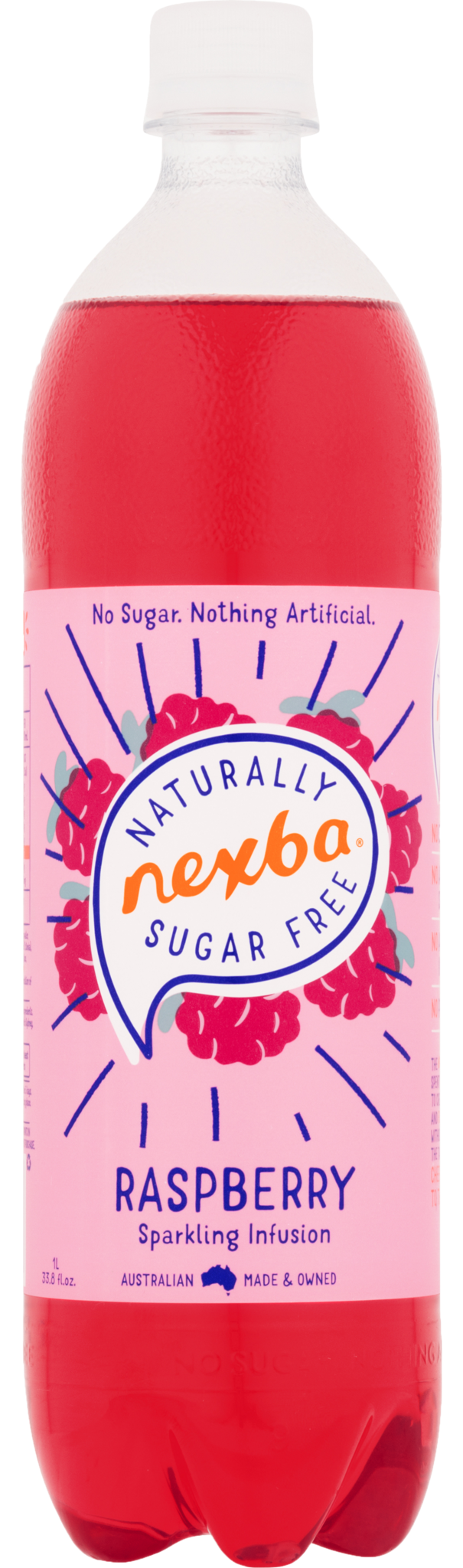
Mr Fotergills Flower Power Van (Tutorial exercise):
Positives:
Cardboard Packaging with no plastic wrap –
Recyclable and sustainable.
Bright, eye popping colours – which draw’s in
the customers eye; it is also attractive for children, who are the target
market.
Easy to understand instructions, with simple
steps on the back, more steps inside the packaging, and a comprehensive leaflet
inside the product. Easy to make with children (under supervision) as an
activity.
Typography matches the theme of ‘flower power’, reminiscent
to the hippy era.
Bright, warm colour scheme, which is eye
catching on the shelf. The raspberry illustrations and the dark blue lines draw
the eye to the brand name.
Contrasting and bold text, the typography is
stylised; which gives the product more individuality and matches the brand
identity (which is a natural, healthy and local product).
Custom made bottle, it is an interesting height
and has a rippled texture with the brand name popping at the top of the bottle.
Negatives:
Limited shelf presence, the bottles were higher
up on the shelf and only took up a small space (Three bottles across).
The bottle height makes the product unstable and
at risk to topple down
One thing you liked about today’s lesson:
The importance of sustainable packaging. Packaging is so
mainstream, with a huge percentage of it contributing to the waste problem,
that recyclable packaging is vital to this earth’s future.
One new thing you learned:
The difference between using glass and plastic with milk
products; although glass is more inexpensive to make (if you already have the
set up), customers perceive it as more expensive and prestigious.
One thing you’re looking forward:
Looking at different brand packaging and understanding how
they are made; particularly the balance between marketing, engineering and
design aspects.