
Local Product Packaging
Reflection:
This week we focused on starting our redesign assignment, looking at local designers and distributers in Canberra. I focused on the Wanniassa Markets, as they are local to my area. Besides exploring and analysing local artists; I also found that, although the shop front was homey and interesting, their packaging wasn’t well developed.
The products I bought came in plain paper bags. Depending on my time frame, within the first assignment I would also like to work on developing packaging for the Wanniassa markets, in which they can use it for marketing and promotion purposes (e.g. as simple as a more structural paper bag with their logo, or as complex as a fabric keepsake).
Local packaging design:
Industrial design – SKEEHAN
Use sample kits to attract new business, with interesting packaging. For small business, packaging is often overlooked and neglected, due to costs and time.
For small studios, it’s important to look for cheat sheets, ways to get products out quicker and save money and time.
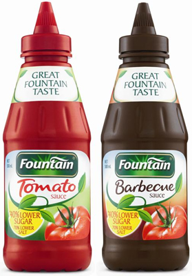
Fountain sauce:
Sauce bottles went from glass to plastic. A new bottle means a fresh face. But there are a lot of barriers; one which has to do with the engineering side of production, eg. Blow moulding. Due to no preservatives in the Fountain sauce recipe, they had to heat up the bottle more which didn’t work with some common bottle shapes. They also want the plastic bottle to match how the glass bottle looked, as there is brand identity and history in it.
Packaging techniques:
- 90% of the time, the box you’re thinking of has already been designed. Look for shortcuts.
- Design isn’t just the most important element – we also have engineering, machinery, packaging, that all goes into it.
- Elements of design can make products looking more ‘prestigious’; such as gold, medals, and using French – what can you do to make a product look ‘more premium’.
- Many kid’s cereals have cartoon characters looking at the cereal, adult’s cereals have a healthy, conventionally attractive person looking at us.
- Companies pay money to get shelf presence – for the perfect height, for the brands close to it.
- How is the product packaged – how the customer interacts with the product?
- Banana is Pantone buttercup 12-0752 TPX – better chance of buying the product – the colour that is perceived as fresh. Farmers manipulate their produce.
- By knowing how things are made – this will help us construct concepts.
Young Guns packaging challenge
The Young Guns redesign challenge focused on 5 young designers around the world (India, UK, NJ, US and Egypt), who needed to redesign the packaging for a $10 or under pharmacy product. They could change the colours, logo and images/graphics. But must keep the typography.
The designers choose items like soap, toothpaste, lotion, lozenges and antifungal medication. They focused on design elements like; element and typography hierarchy, key traits, logo re-design and typefaces. The process started with traditional sketches, which then translated into digital design. Some designers focused on a functional design, while others worked with a loose design (with no master grid).
In the critique process, the judging criteria went as follows:
- Brand integrity and product positioning
- Shelf presence
- Improvement
- Clarity and communication
This criterion was really helpful for the next assignments in this unit, as it helps give a base to work on when designing or redesigning packaging.
Some critique the judge gave to the young designers, which is important to keep in mind when designing my own packaging, was;
- ‘What do we need to communicate?’ Figure out what elements are important (for not only the design, but also the information about the product for the consumer) and how you are going to display them. As well as the relationship between the elements.
- Bold colours on the packaging give better shelf presence. (‘customers look for distinguishing marks on packages’).
- A simple, clean layout can read really well.
- ‘Feature the unique parts of the product’ When changing logos, be careful if you are taking away or translating information, this taking away brand equity.
- ‘Highlight the unique features of the product’ Is there unique elements which need to be highlighted or solidified.
- When designing a packaging don’t just think of it as a 2D design, but as a 3D object. How can you elevate the design in a 3D form?
- Push the boundaries of design
- Use gridlines to help you design!
- Rules (lines) can help group pieces of information together.
- If the product is beautiful – don’t hide it with packaging. With Premium products – less can be more.
- Look at other products which relate to your redesign – especially those which are more premium as that will help how you can elevate your design.
- ‘Tie designs together’ choose an aesthetic and extend it through the design, which will tie the elements together.
Visit to retailers of local designer goods: The Markets Wanniassa
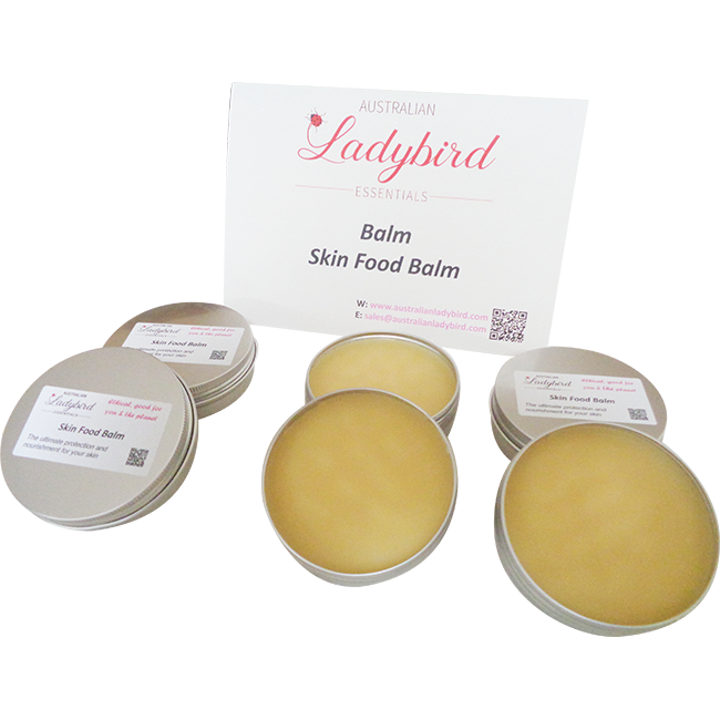
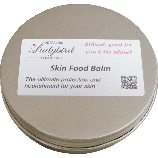
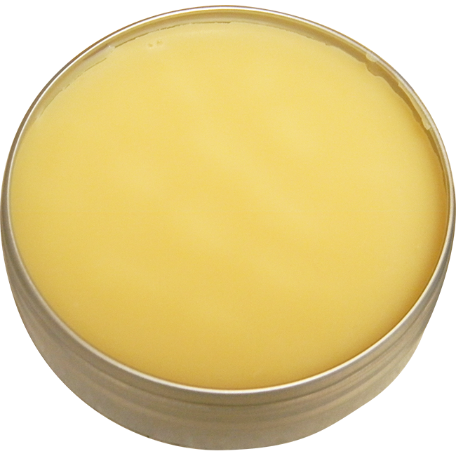
Item 1: Ladybird Essentials – Skin Food Balm
https://www.australianladybird.com/
Lady Bird Essentials make a range of natural skin care, including scrubs, balms, and moisturisers. They’re packaging is simple, different sizes of metal tins with a rectangle sticker on top. Their logo is their brand title in cursive typography, with a small lady bird attached to the ‘L’. The identity of ‘skin care’ isn’t articulated well in the packaging; even the title ‘Skin Food Balm’ on the tin leaves some room to wonder what the product is used for exactly. There is a QR code provided. The target market are women interested in natural skin care. Their stickers could be redefined to be circles to fit the tins, which would not only give them more room and clarity with their design, but also offer space to specify each product. They could also branch out into glass packaging, which is popular with other high end skin care brands such as La Prairie and Herbivore skin care.
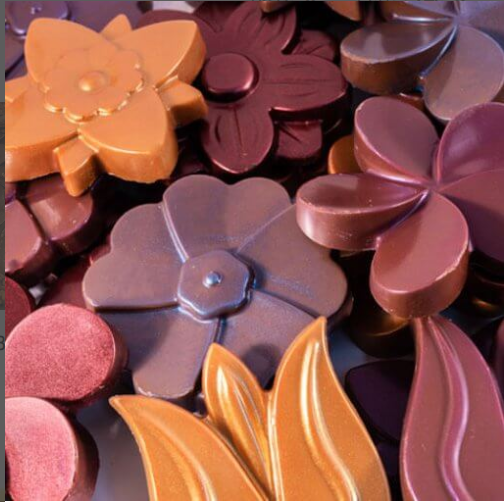
Item 2: Enigma Fine Chocolate – Madagasca Dark Flower
The Enigma Fine Chocolate was perceived to be the most problematic when it came to packaging. Despite offering a range of beautiful, fine, chocolates; the packaging was a plastic satchel. A few of the products on the shelf were chipped or broken because of this. Even when purchasing one, the store clerk exclaimed that they were very nice as someone dropped one and broke it, so he gave them another one and he got to consume that one.
The product itself has a solid brand presence, the logo and the website are professional and relate back to the idea of ‘handmade artisan chocolates’ which the brand is promoting. I feel like their packaging is the only thing lacking. Their target market are chocolate lovers.
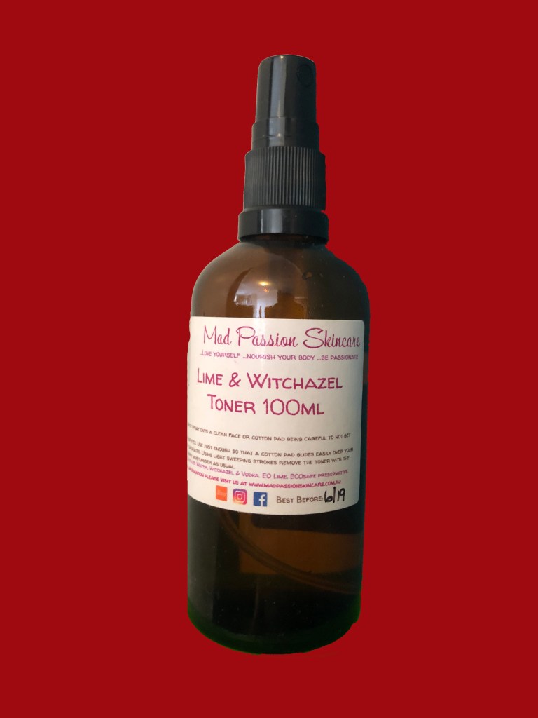
Item 3: Mad Passion Skincare – Lime and Witchazel Toner
Mad Passion Skincare offers a range of skin care products and bath products, including; foams, toner, bath bombs, scrubs and more. The website displays their brand logo well, but the logo gets washed out on the packaging itself. The pink/purple/blue colour scheme appeals to their target market, which are women who are interested in skin care. The glass bottle appeals as it looks more expensive and prestigious than plastic. But it is also more breakable. If I were to take this brand for the re-design assignment, I would want to work on a outer protective packaging as well as the sticker design for the bottles.
References:
SKEEHAN. (2019). Retrieved 19 August 2019, from https://skeehan.com.au/
Fountain Tomato Sauce a Recipe for Success. (2019). Retrieved 19 August 2019, from https://www.female.com.au/fountain-tomato-sauce-a-recipe-for-success.htm
Australian Ladybird: Home. Retrieved 19 August 2019, from https://www.australianladybird.com/
Lavender and Lace Cakes. Retrieved 19 August 2019, from http://www.lavenderandlacecakes.com.au/
Enigma Fine Chocolates. Retrieved 19 August 2019, from https://enigmafinechocolates.com.au/
Mad Passion Skincare. Retrieved 19 August 2019, from https://madpassionskincare.com.au/
Herbivore Botanicals. Retrieved 19 August 2019, from https://www.herbivorebotanicals.com/
La Prairie. Retrieved 19 August 2019, from https://www.laprairie.com.au/
