
Presenting Skills
- Fake it
- Remove the emotional side when presenting work, accept criticism (not personally) as it will help you in the end.
- Prep –
- A summery of key points (structure to the presentation).
- Practise and practise – it’s a confidence booster when you know your presentation in and out.
- Make props – do mock-ups and large sketches.
- A pitch in the real world: Research who is in the room (who are they, why are they there, what do they bring, what do they want to hear from you?).
- Accepting and giving critique –
- Assess flaws in the design.
- Identify the good and the bad (a feedback sandwich: positive, negative, positive.)
- Analyse brief and how it came cross.
- It’s a new perspective on the work.
Is the print production technique successful in appealing to the target market, and why/why not?
Looking at three packages with different techniques; e.g. embossing, foil stamping and die-cutting. I will analyse the products in terms of the target market. I focused on cosmetic and hygiene packaging, as the market is overflowing with competing brands. So the individual product must stand out and have great shelf presence.
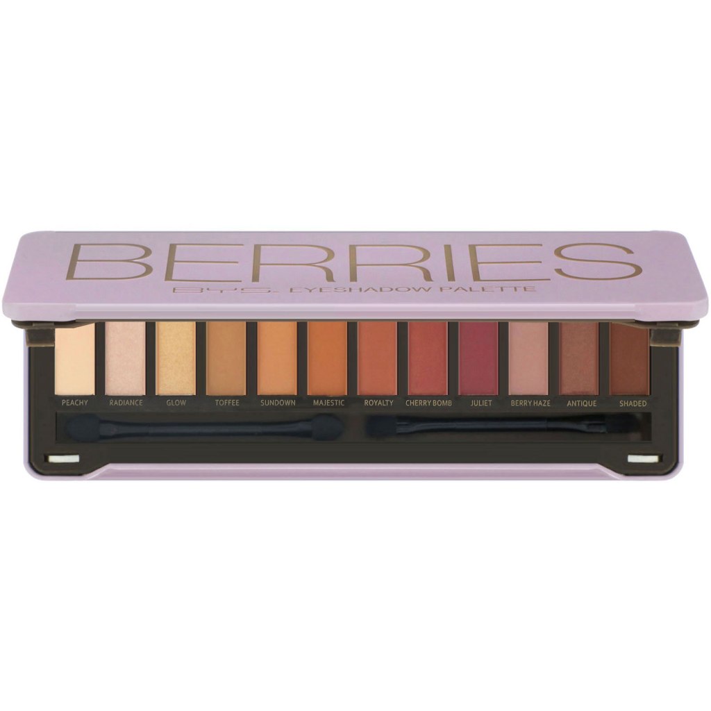
BYS Cosmetics – Embossing
BYS Cosmetics is a makeup brand commonly found in Kmart and Target, its a inexpensive brand targeted towards young women and teenagers. With eye shadow pallets called ‘Berries’ and ‘Fierce’.
The packaging incorporates metal embossing on the lid, extruding the wording to give a 3D effect. This gives the packaging a unique and eye catching effect. It also makes it look more expensive, which attracts consumers.
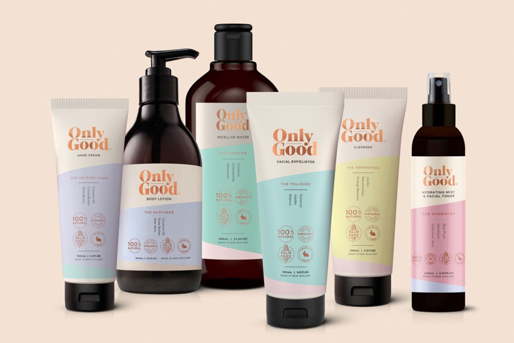
Only Good – Foil Stamping
Only Good is a New Zealand all natural skin care brand. They have skin care, baby care and hair care ranges, all vegan and cruelty free. Their target market are those who are interested in cruelty free, sustainable products, their pastel colour scheme could be marketed towards young people.
The packaging incorporates a gold foil stamping effect on the logo, on both the plastic and cardboard packaging. This gives the packaging an edge, as it stands out on the shelf and in photos.
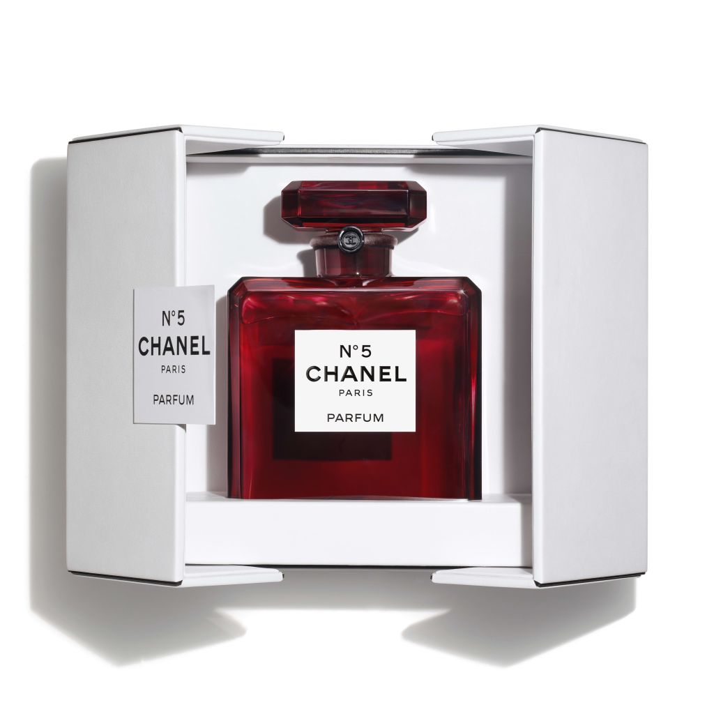
Chanel perfume – Diecutting
Chanel is a prestigious and expensive perfume brand. Their target market are women who are looking for a high end elegant perfume, although Chanel cosmetics are marketing towards young women.
Their complex diecut boxes give the user a experience, which is what they expect for such a high end product.
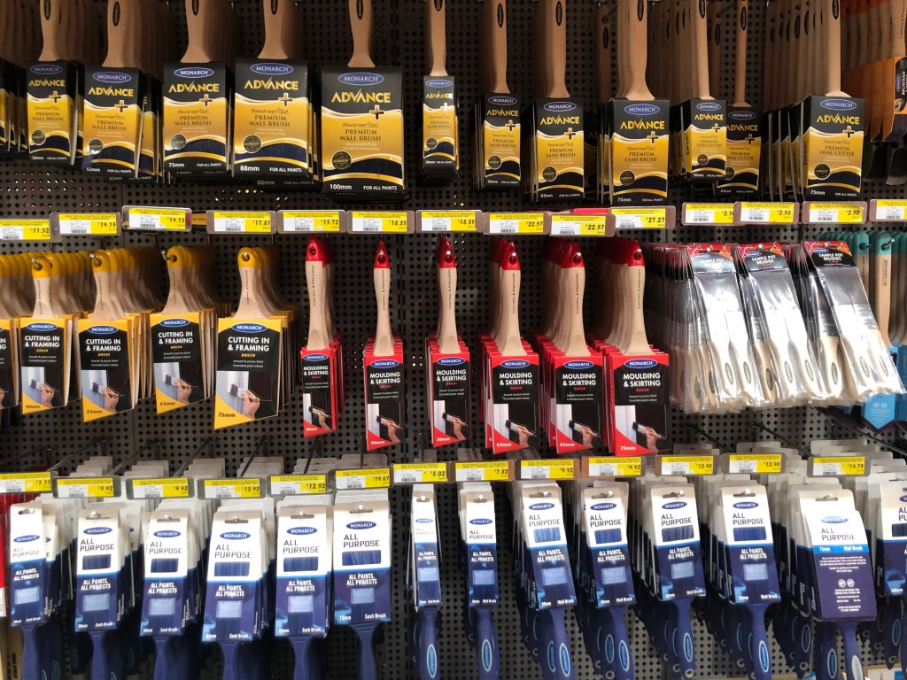

Paint brush Redesign
The challenge was to find a paint brush from Bunnings, $5 or under, and redesign the packaging for it to increase the value of the product. My goal was to redesign it in such a way that you could potentially double the price without the re-branding process costing the company substantially.
My process went as follows:
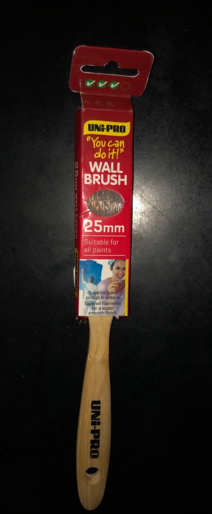
- I bought a $3.90 ‘wall brush’ by Uni-Pro. I then examined the other paintbrushes on the shelf around it. Focusing on the expensive brushes, to figure out what the competition is and how I can give my re-design the design face lift.
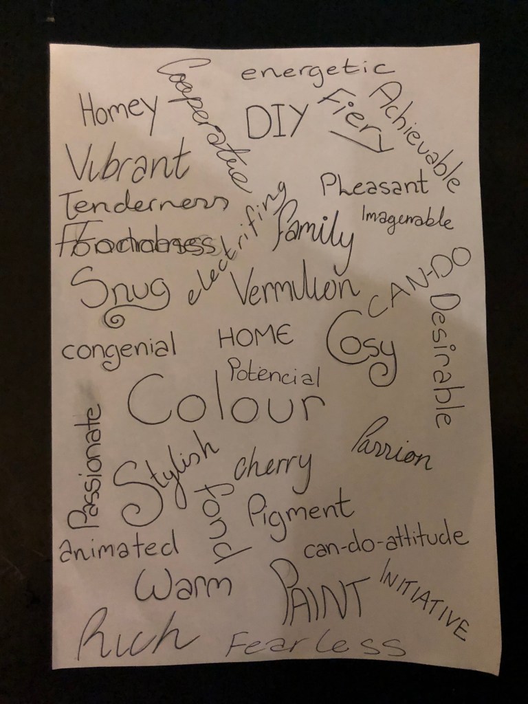
- I created a mood board for the ‘brand identity’, focusing on buzz words such as; Red, vibrant, family and home.
- I brainstormed a list of words and typography; using the same buzz words for the mood board and expanding them. Working on the pretence that the target market are average families and adults working on home projects and painting houses, rather than the professional.
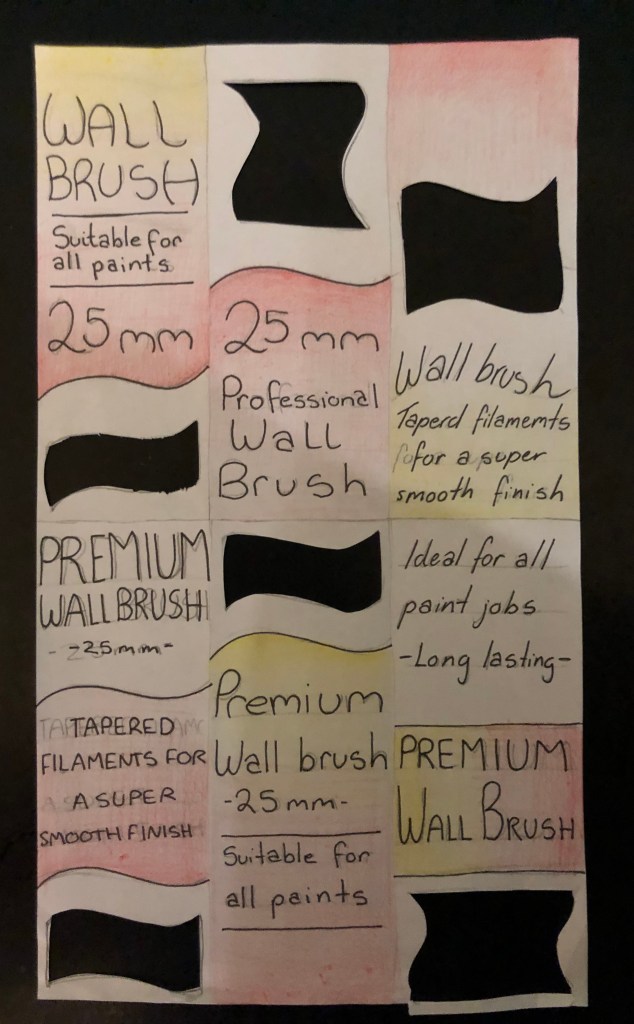
- I then worked on prototyping, working with the key points I wanted to fix, from the initial analysing of the brush. These were; adding an open window so the customer can touch the bristles, simplifying the design – hence making it sleeker and more modern, using the buzz words on the back of the brush (such as ‘Tapered filaments for a super smooth finish’ which makes it sound more prestigious and professional). I also decided to keep the red and yellow colour scheme, as it is eyepopping and bold, hence giving the small product solid shelf presence.
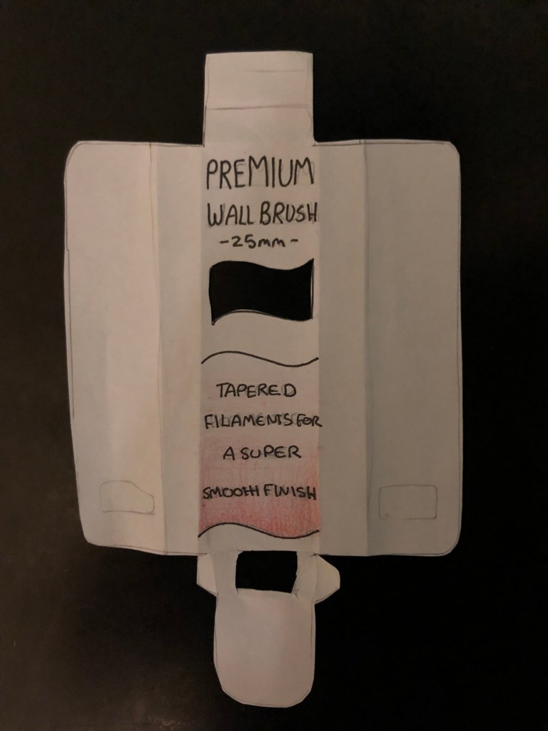
- From the last stage, I melded my favourite designs into one mock-up. I took away the UNI-PRO logo from the packaging, as it is on the brush itself. Instead translating it into the cut-out window. I also followed the flow of the lines into the packaging’s visual design.
All of this was done traditionally, as I found it helpful to work with a pen and pencil format for this week-long project. The next stage would be translating the design digitally, which would open up new problems and solutions, and working on the back and sides of the packaging. I also planned, in my final design, to flip the brush itself and take away the tab, instead hanging the brush from its handle.
Mad Passion Redesign
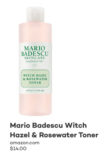
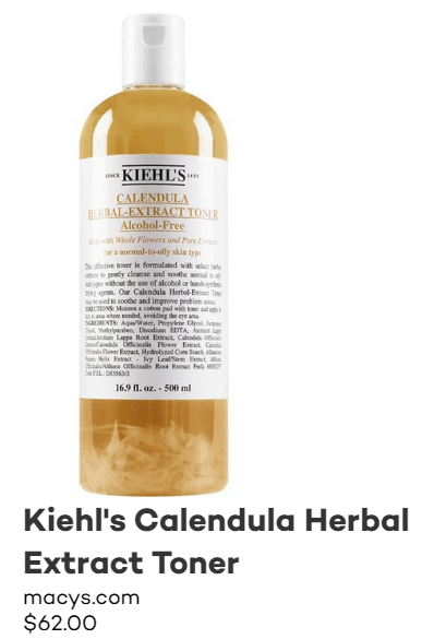
Looking at other skin care brands, I found three popular face toners. All from well known brands, but all at different price points. This will give me a good base to work from when redesigning my next assignment, which is the ‘Mad Passion’ Witch hazel and Lime Toner.
Some common factors in all these toner packaging designs are:
- All have a basic colour scheme – of one or two colours (including the colour of the bottle.
- They all have a flip top instead of a spray – some people prefer spray as its easier to use (you can just spray directly onto your face instead of dripping the toner onto a cotton pad and wiping). But with the flip top you are saving more product.
- Commonly they have a simple and clear design on the front label.

Key Points for my redesign:
- Digitalise and modernise the logo – it’s such a nice logo but at the moment it’s getting lost due to lack of structure to the label and poor printing.
- Use recycled glass bottle – less of an important point, but I would like to find some companies which supply bulk recycled glass for low cost as a reference point.
- Clear labels VS stickers – can I find a sustainable clear label?
- Label for the front and back – put product information on the back.
- They put it in a separate bag – add another outer packaging for the product, to protect the glass. Which will make it look more expensive and prestigious than changing the bottle to plastic.
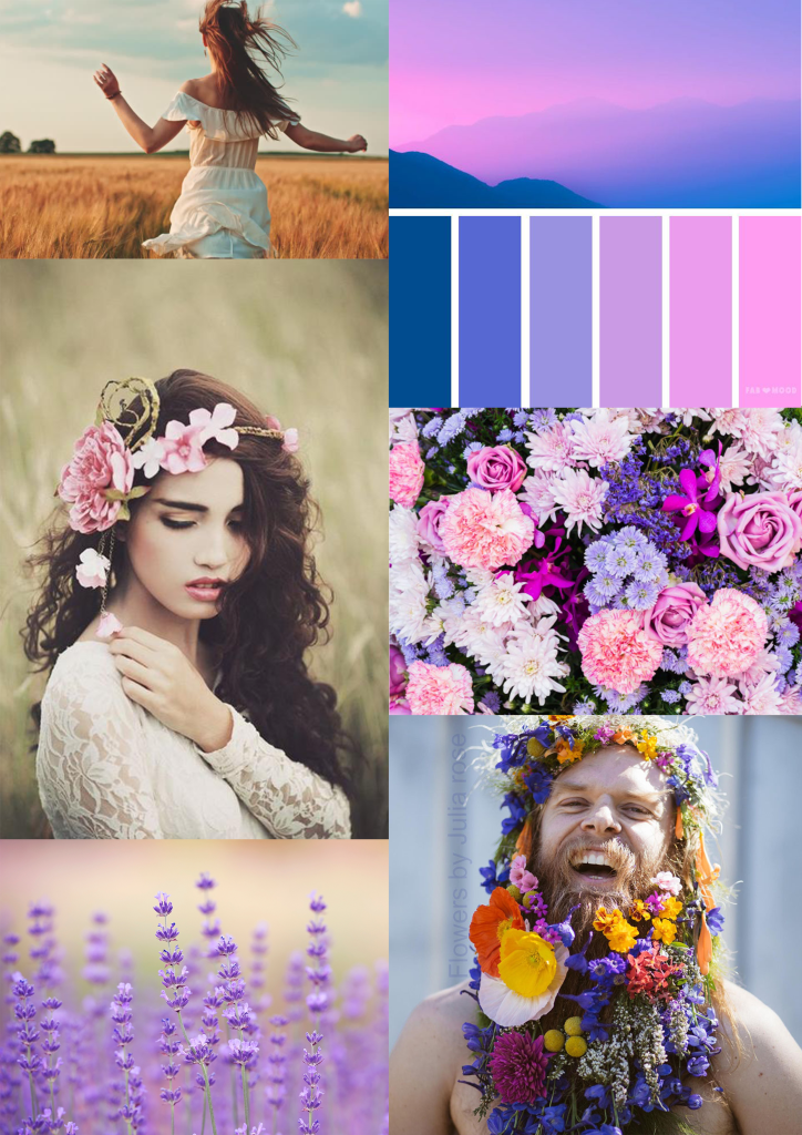
Below to the left is the mood board for the brand identity, which I am exploring. I want to focus on a feminine/androgynous feel, as there are the floral symbol and the warm pastels.
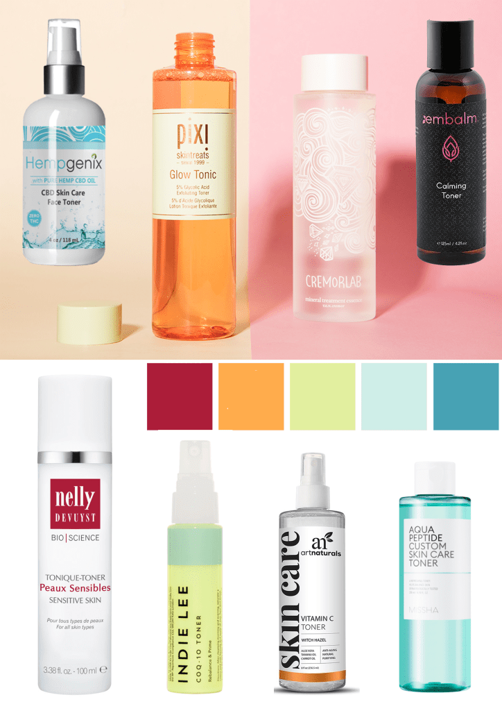
Below to the right is the mood board for other toner brands. So I have a sense of the market and the competition. I will continue to reference it as I progress with the design process.
References:
BYS, Retrieved 31st August 2019. From https://www.bys.com.au
Only good, Retrieved 31st August 2019. From http://www.onlygood.co.nz/
