
Structural Packaging
Can your design be produced? – Packaging Production
Consumer Packaging – making something physical rather than something digital.
Digital to Manufacturing – Technology has evolved in such a way where, in what used to be a traditional way of designing, is now very much digital all the way up to the production stage. So, it’s critical that, as designers, we understand how to translate from our digital designs to the 3D world.
Our designs need to be able to translate from digital to physical in the way in which we envision it. Or we will create an unprintable design.
Its important to have the knowledge on packaging production as a designer, as not only will your designs will work, but you can communicate any issues or solutions to the production team.
Some elements which can be used in packaging production are:
- Flocking – applying small fibre particles onto a surface, this will achieve a fuzzy suede texture
- Embossing – creating raised or recessed designs into the packaging
- Silk screen – a mesh sheet is used to transfer ink onto the packaging
The packaging can be a collectable item, it doesn’t have to be something which we throw away. Especially if it’s done successfully and has a reusable purpose.
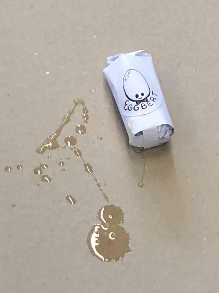
Egg drop challenge
The egg drop challenge involved creating protective packaging for a raw egg, in which it could be dropped from several different heights without breaking.
Our group first looked into if using a square packaging or cylindrical packaging would work best, deciding that cylindrical packaging would assure that if it rolled onto its side from the fall it would lessen the impact by rolling.
I knew that sitting the egg up works best, as the two points on the bottom and top are its strongest (I have three chickens). So we worked on adding structural integrity with crumpled paper and straws.
Unfortunately, as the photo and video shows, our packaging didn’t last. The main issue was that the bottom, which hit the ground, was too harsh.
Mad Passion redesign – Assignment 1
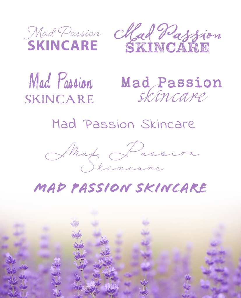
Working on the next assignment, I wanted to find out more about the logo and what it meant to Tresna, the owner. She explained that it was painted by her son, and for her it symbolises:
- The love of family
- The calmness of nature
- The natural ingredients in the products
These points help solidify the direction I would like to work on with the re-design. Putting a spotlight on the values of the brand.
