
Packaging Redesign
Rebranding in Package Design
Why would a brand redesign their product?
- To have a brand ‘revamp’ – to make the product more interesting.
- To make the packaging more sustainable or recyclable.
- To maintain a position on the shelf and in marketing– if the product has gone stagnant.
What a brand wants a ‘refresh’ for their product – what does this mean?
- To have a change, to gainer more interest from potential customers.
- To make the packaging more modern – to make the product look new.
- Just to make tweaks, to change the ‘feel’ of the product.
How and why do designs go out of style?
- Trends change.
- Technology and cosmetics progress and evolve.
- Design and typography go out of style.
Isn’t it our job as designers to design things to be timeless?
- We can only give an independent point of view, what the mass market wants at the time.
- Elements which we identify as ‘timeless’ can evolve into cheesy or bad.
Can a good design still need an update – or is that a sign of a bad design?
- Different industries have different needs; such as the food or technology industry is always changing, but the fashion industry is built on a heritage.
You need to do the research in what the customer wants, you can’t just change an established product without thought.
Packaging Redesign Reflection– Lynda
- Diet Coke Redesign – Coca cola wanted to capture brand loyalty for a younger generation, while keeping its older market in mind. They wanted the brand to be more relatable, using a sleek design with new flavours. Using a highline to represent motion, a strip of colour and a taller and skinner can – Coca cola could gain interest from a range of consumers.
- Logo’s are the foundation for the brand identity – it helps the consumer relate the product to the company and the brand. But design elements can also help strengthen the connection E.g. Apple’s packaging design can be connected to apple without the logo (simple colour apllet, sleek and modern design).
- Audience recognition is an important element to keep in mind when doing a redesign – what is the brand identity and how does the packaging need to convey that?
Young guns season 2 – Packaging redesign
Young guns season 2 critiqued young designers from all over the world. Some points which I took from the videos were;
- When working on food packaging, some important elements to incorporate into your design process are; does it have appetite appeal, does it have shelf presence, does it highlight the products features and is it appropriate for the brand/product.
- Be aware of how the consumers view packaging in store; what pops out to you, how do you make purchasing decisions based on value?
- Who is the intended user for the product and how does that correlate with where the packaging sits in store?
- People don’t buy what you do, they buy how you do it.
I have found these design challenges really helpful in understanding my own design process and what I need to improve on. I find that I spend too much time on some parts of the process and don’t enough time on others – I spend too much time in the research time and not enough on the prototyping/brainstorming stage.
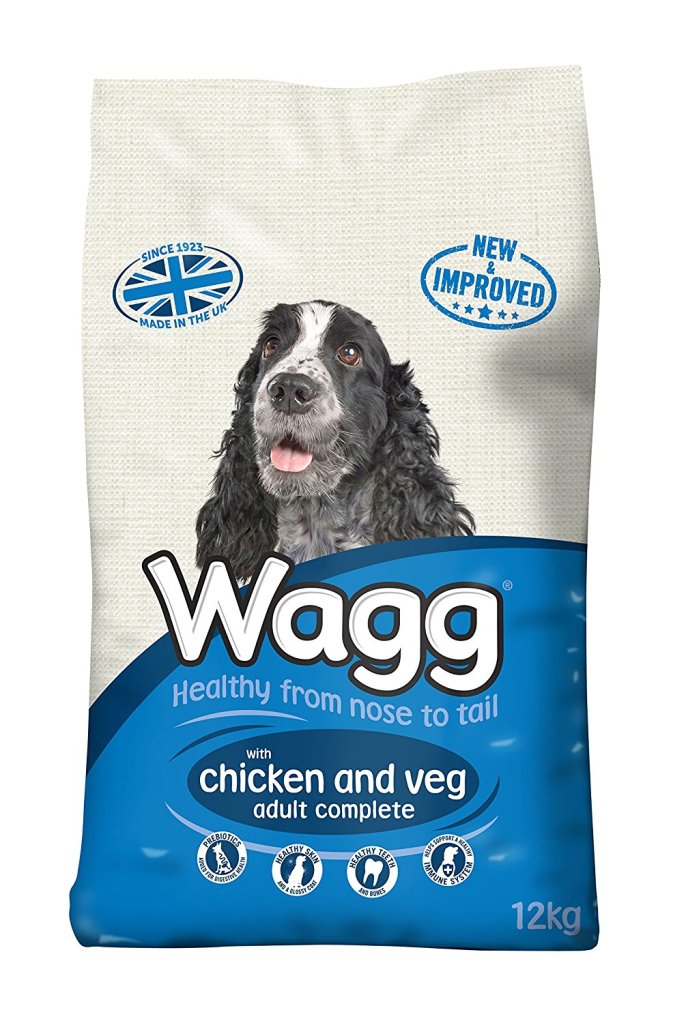
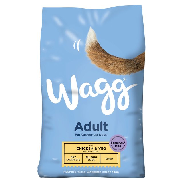
WAGG Dog food redesign:
WAGG, an Australian dog food brand, had a massive redesign in 2018. As defined by Packaging Europe, this redesign was due to the brand wanting to strengthen their brand values and displaying a ‘prestigious style’ in a low-cost product for the common consumer. Their old packaging displayed different species of dog for each flavour, with a bold bubble font.
Some positives with the new packaging was:
- A sleeker and more modern look.
- The lack of one species of dog makes it seem more inclusive (for every dog).
- A bright bold colour scheme, which gives the product an eye-popping shelf presence.
Some negatives with the new packaging was:
- Besides the dog tail and the connotations to the brand name ‘Waggs’; the product doesn’t come off as a dog food brand as well as the old design.
- The information on the bottom of the packaging is laid out in a way similar to wine or coffee.
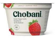
Chobani Greek Yogurt Redesign:
In 2007 Chobani Greek Yogurt was launched; and in preparation for its 10-year anniversary, the brand launched a packaging redesign in 2017. The new packaging was designed to give the brand a traditional look, which in turn would give it heritage and prestige. Out of the three packaging redesigns here, this rebranding is the most successful.
Some positives with the new packaging was:
- The layout of elements meant that the first thing customers spot is the Chobani logo.
- The typography change not only gives the design a more traditional look, but the chunky, smooth serif also helps convey the richness of the yogurt – rather then the bold and clunky old font.
- The water colour strawberries give the packaging a homier vibe, rather than the cliched photographed strawberry on the old packaging.
Some negatives with the new packaging was:
- Taking away the red band on the top can be a risk to shelf presence, as the new packaging doesn’t pop out on the shelf as well.

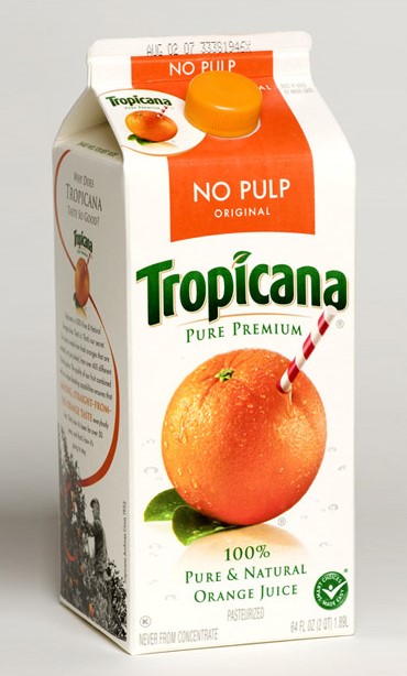
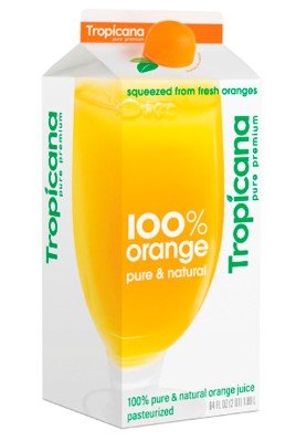
Tropicana redesign:
In 2009 Tropicana redesigned its packaging for a more modern look, however the rebranding was a huge failure and they reverted back to the original packaging after many customers rejected the new brand design.
Some positives with the new packaging was:
- The orange cap is a creative feature (with not only the colour but also the texture of an orange replicated), which helps signify that the packaging is orange juice – however it is not obvious and can be missed on first inspection.
Some negatives with the new packaging was:
- They lost significant money due to their brand redesign, this was because the new design took away from brand loyalty.
- Taking away the orange imagery from the front of the design meant that Tropicana lose the connotations from that.
- Although the new typography is more contemporary, it loses its brand identity due to design and layout. As, at first glance, the juice doesn’t convey that it is ‘Tropicana’.
Redesign challenge:
Find a product under $5 from Bunnings – get a paintbrush – have a look at other more expensive packaging
- Start with an image/s – for inspiration Mood board – three/four images
- Come up with words from image – 50 words
- Pick a type Face – typography 50 professional
- Start sketching – making prototypes – using boxes and cutting them out and adding things to them. 50
- Pick best sketch – best prototype – top 3 of different sectors (bespoke, commercial, experimental)
- Colour choices – colour theory – find all colours which aren’t right – find specific colours
- Start exploring packaging designs – explore what goes into the package (pricing, place)
- Add finishing touches – mock-up
References:
Wagg Foods. Retrieved 19 August 2019, from https://waggfoods.com
Robot Food rebrands Wagg. (2018). Retrieved 19 August 2019, from https://packagingeurope.com/robot-food-rebrands-wagg/
Chobani. Retrieved 19 August 2019, from https://www.chobani.com/
Mohan, A. (2019). Chobani stays on top by staying in front | Packaging World. Retrieved 19 August 2019, from https://www.packworld.com/article/package-design/redesign/chobani-stays-top-staying-front
Tropicana. Retrieved 19 August 2019, from https://www.tropicana.com
What to learn from Tropicana’s packaging redesign failure?. (2019). Retrieved 19 August 2019, from https://www.thebrandingjournal.com/2015/05/what-to-learn-from-tropicanas-packaging-redesign-failure/
